Soundtrack for your pleasure
Just press play:
Branding
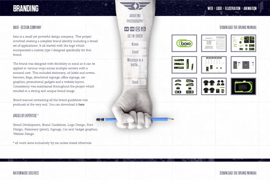
baio - design.company
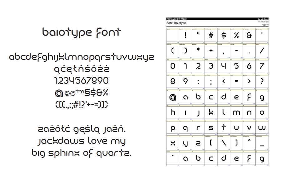
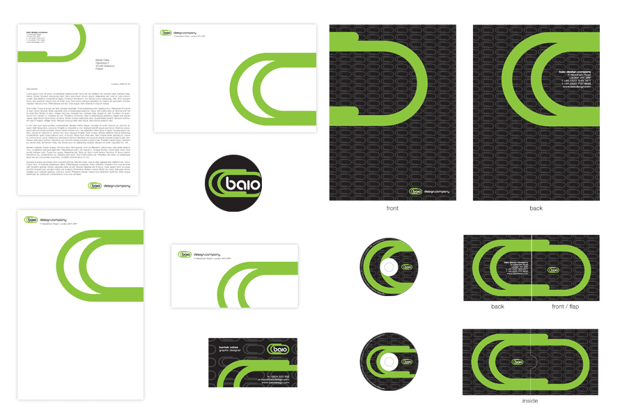
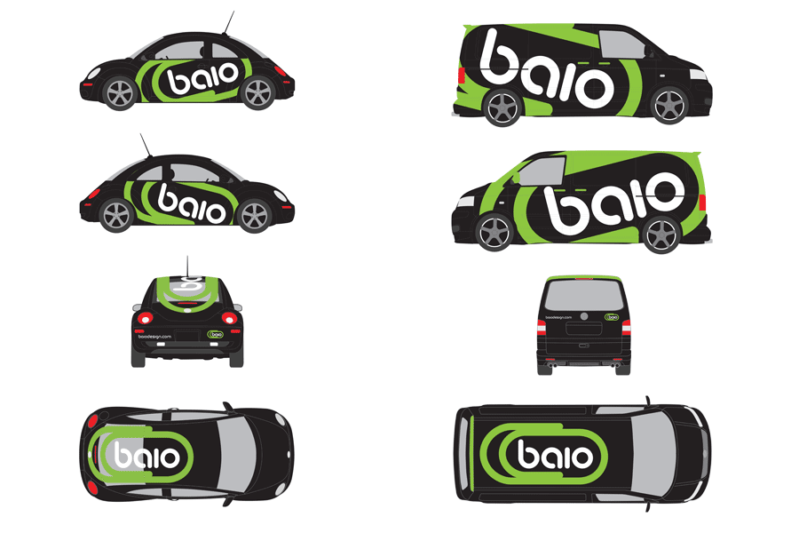
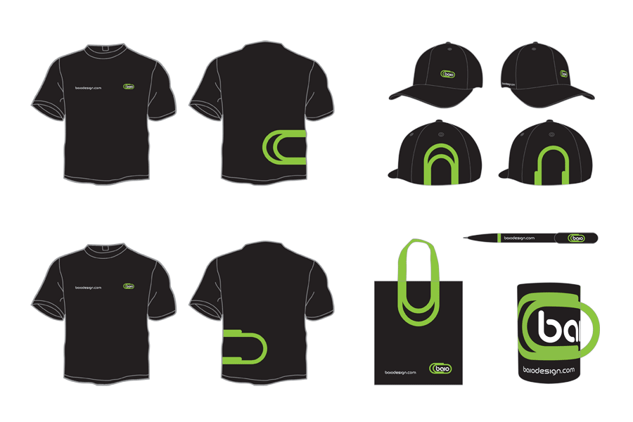
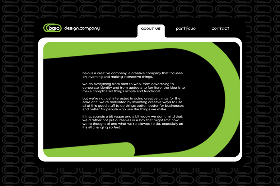
baio is a small yet powerful design company. This project involved creating a complete brand identity including a broad set of applications. It all started with the logo which incorporated a custom type I designed specifically for this brand.
The brand was designed with flexibility in mind so it can be applied in various ways across multiple carriers with a minimal cost. This included stationery, cd labels and covers, banners, flags, directional signage, office signage, car graphics, promotional gadgets and a website layout. Consistency was maintained throughout the project which resulted in a strong and unique brand image.
Brand manual containing all the brand guidelines was produced at the very end. You can download it here.
Areas of Expertise *
Brand Development, Brand Guidelines, Logo Design, Font Design, Stationery (print), Signage, Car and Gadget graphics, Website Design
* all work done exclusively by me unless stated otherwise
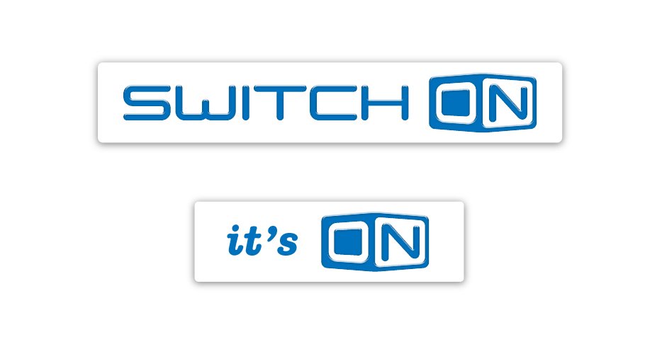


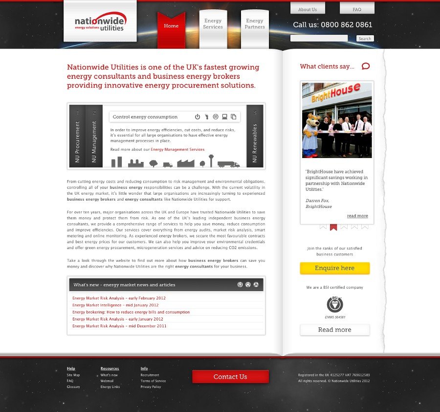
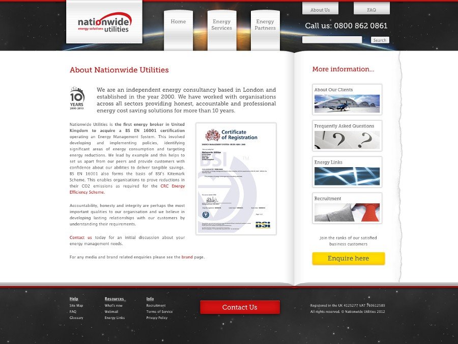
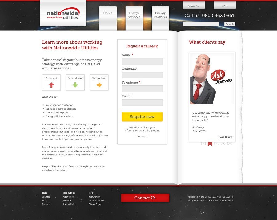
Nationwide Utilities
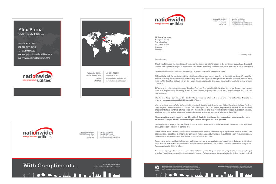
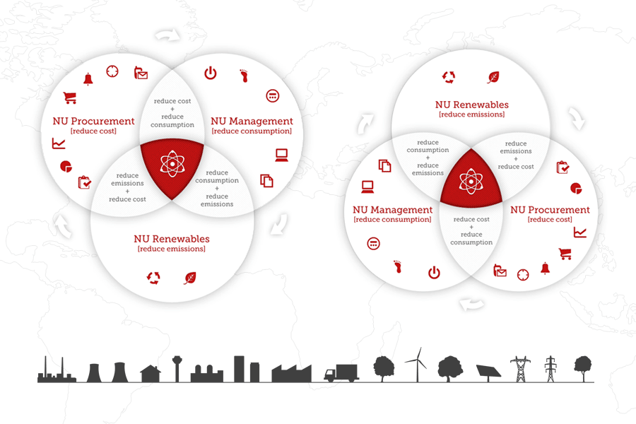
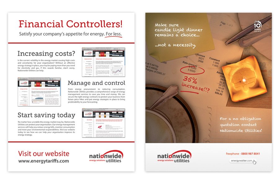
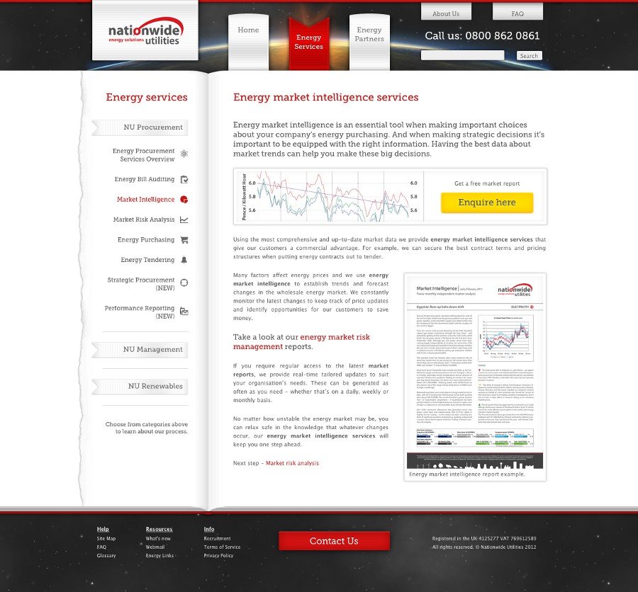
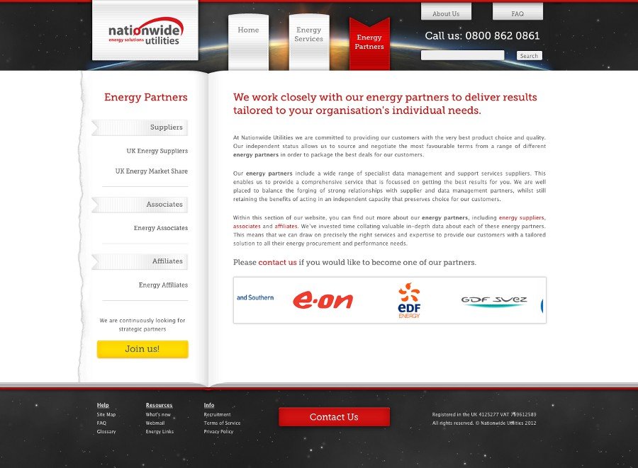
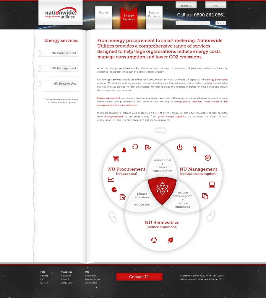
Nationwide Utilities is a small energy brokering company. Their brand needed a solid refresh which started with the their logo. With the new logo version in place, new website became a priority. The look and feel of finalised website design dictated the graphical style for stationery, office signage and document templates.
With the core brand materials completed, the company wanted to start spreading the brand awareness using print advertising and digital marketing efforts. This included adverts in annual customer guides and email marketing campaigns. Email marketing also involved existing customers with regular energy market report newsletter.
As usual the brand manual was completed in the last stages of branding process. You can download it here.
Areas of Expertise *
Brand Development, Brand Guidelines, Logo Re-Design, Stationery (print and digital), Signage, Content Strategy, Document Templates (Word, Excel, PowerPoint, Keynote), Print Advertising, Illustration, Web Design & Development (including HTML Emails)
* all work done exclusively by me unless stated otherwise


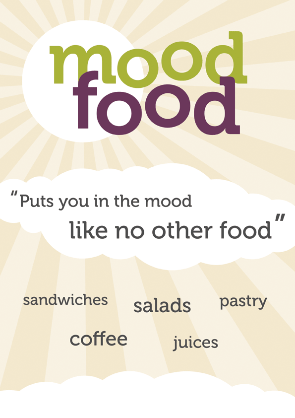
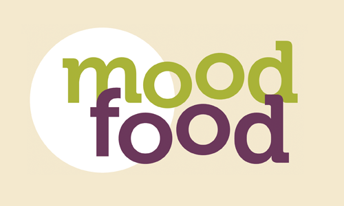
Mood Food
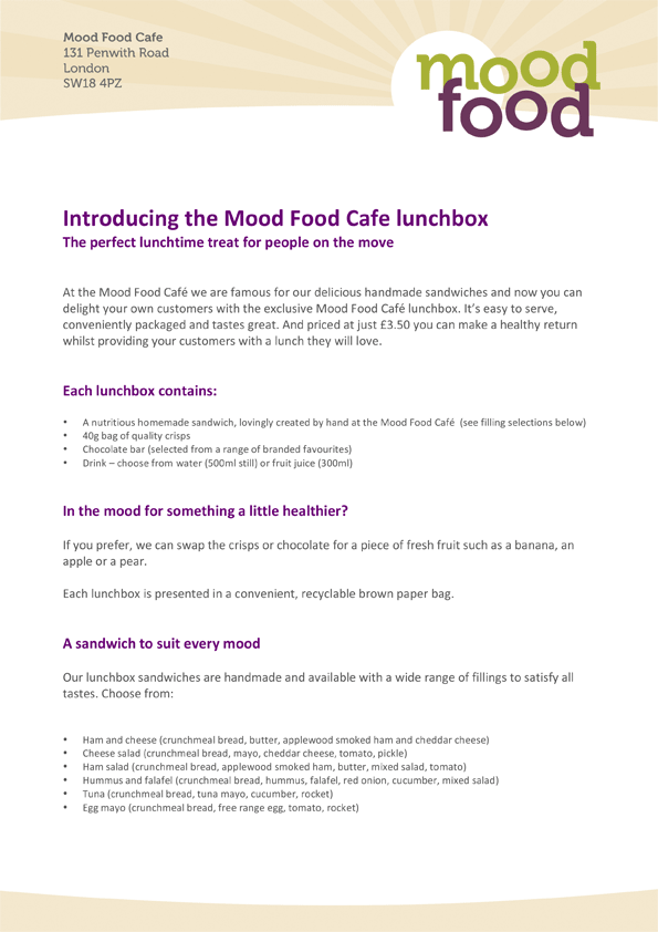
Mood Food is a small cafe offering not only coffee and tea, but also a choice of sandwiches, salads, cakes and juices. The logo and accompanying brand image was designed on a budget within a very short space of time.
There was one specific requirement for the logotype to be used also in a shorter form, as a monogram (mf). This symbol would be later used on food labels. The brand colours had to play well with the paint colours already chosen for the cafe's interior and exterior look, therefore beige was the choice for backgrounds.
The outdoor sign and flyers were designed in quick succession to be ready before the cafe's opening date. The menu followed right after the sign was printed and a letterhead design complimented the basic identity later on.
Areas of Expertise *
Brand Development, Logo Design, Stationery (print), Signage, Document Templates (Word)
* all work done exclusively by me unless stated otherwise


Web Design
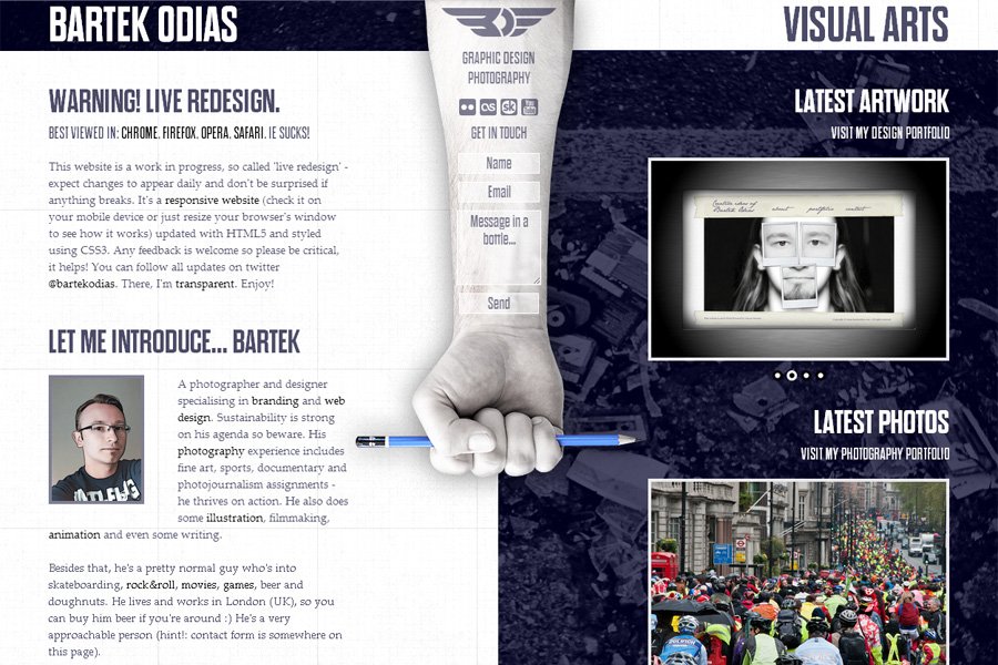
bartekodias.com - version 1
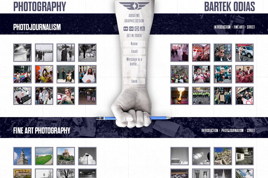
My old portfolio website was recently updated with HTML5 and CSS3. I used some tricks, like remote rollovers in pure CSS (without the use of JavaScript), CSS3 transforms animated with transitions and lots of positioning. I tried to cut down on load time and limit the number of image requests in these heavily graphic-driven layouts. Thumbnails in the portfolio are independent from their (polaroid) frames and have a set width and height which enables me to update them quickly even without using Photoshop or other advanced graphics applications. The whole layout is horizontally and vertically centered - try resizing your browser window.
Top menu typography was set in free Jane Austen font using @font-face rules. The other font used here is the good old Georgia. I used the Lightview plugin to display artwork and photos in the portfolio section.
All photographs used in the layouts (face parts) were taken by me, most of them on old-school film :) and then retouched in Photoshop.
Everything works properly in all modern browsers (Chrome, Firefox, Opera, Safari, etc.) and the website is usable in Internet Explorer.
Areas of Expertise *
Web Design & Development, Content Strategy, User Experience & Usability, Photography
* all work done exclusively by me unless stated otherwise


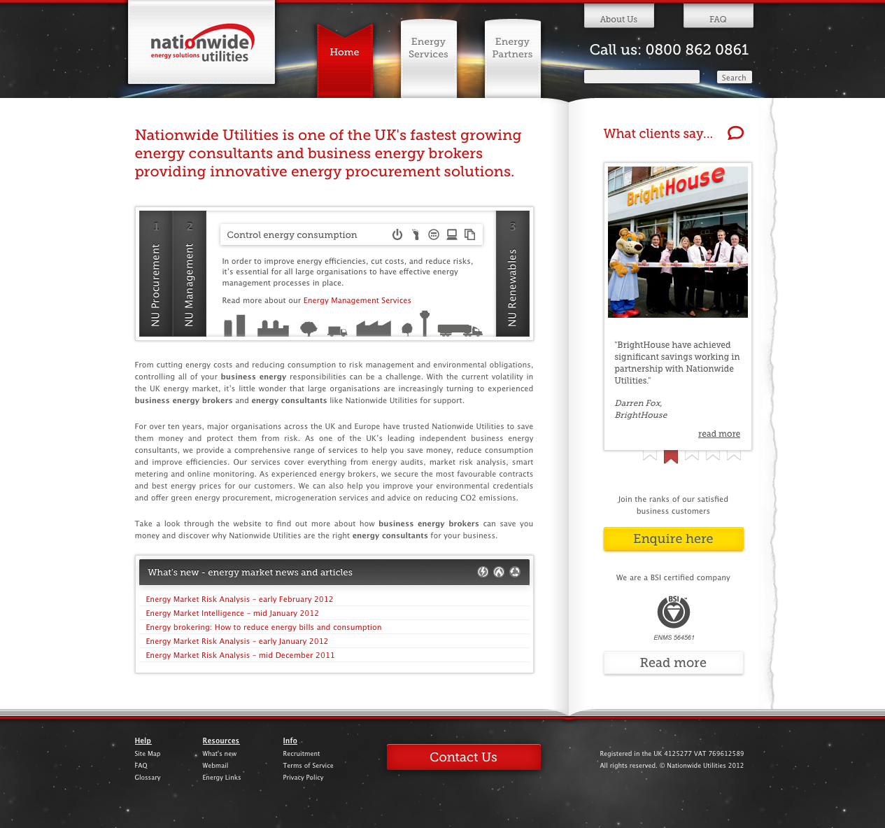
Nationwide Utilities website
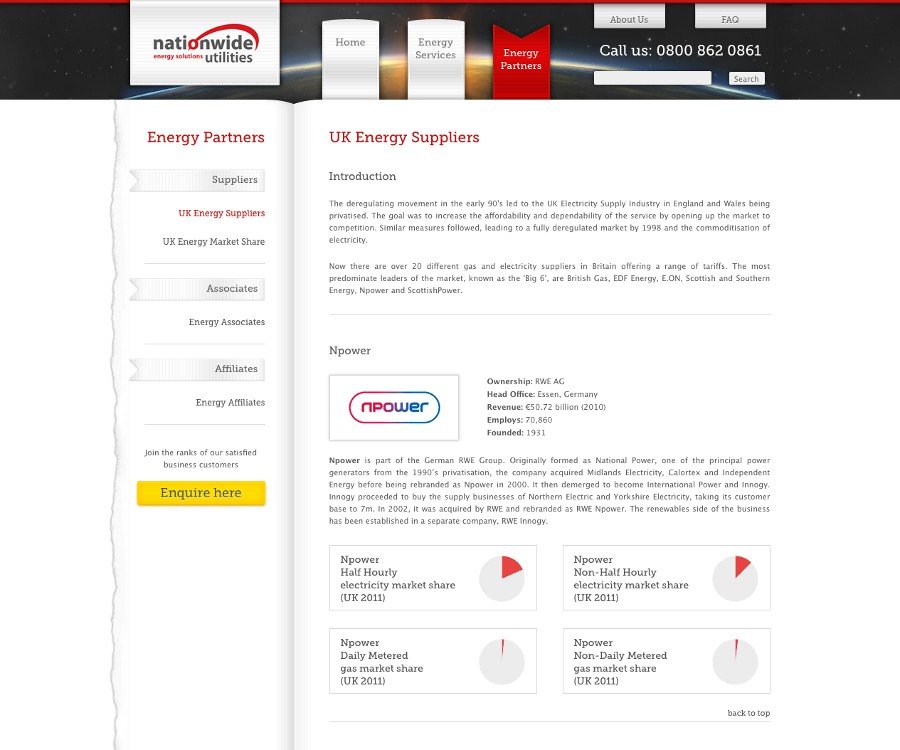
This website was completely redesigned, or rather designed from scratch and coded in HTML4 using CSS3 to style some elements. WordPress was used as a CMS (Content Management System) and a custom theme was designed inline with the look and feel of the brand. I used several customised jQuery plugins for image sliders, accordions and window scrolling. Google Custom Search has been seamlessly integrated with the design and Google Chart API was used to display graphs in the market share section.
Much thought has been put into the content strategy, site and page structure. Everything was search engine optimised and I spent a lot of time on keyword research and competition analysis. Landing pages were optimised in the final phase to work with Google AdWords campaigns. The final phase was optimising the landing pages to work with Google AdWords campaigns.
Accessibility was the major target for this website therefore it works well even in Internet Explorer 6. After introducing all optimisations, the traffic increased by at least 100%. The website is now easily upgradeable and can be updated daily via the CMS by company staff with minimum training.
Areas of Expertise *
Web Design & Development, Content Strategy, User Experience & Usability, Cross-browser Compatibility, WordPress CMS, Search Engine Optimisation, HTML Email Design, Digital Marketing
* all work done exclusively by me unless stated otherwise

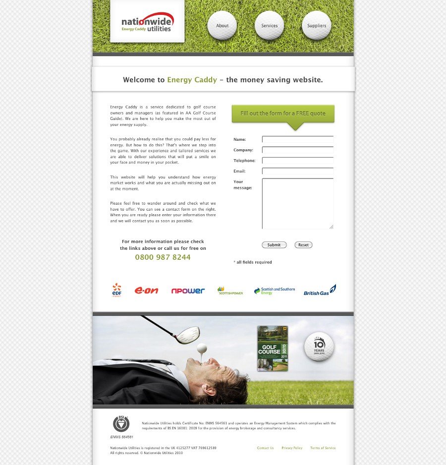
Energy Porter / Energy Waiter / Energy Caddy
A series of websites for Nationwide Utilities' print advertising campaign. Adverts targeted at hotel, restaurant and golf course industries were published in annual publications with links to those three websites.
The websites are very simple, each one of them has only 7 pages and is styled differently for each target group. Some sound effects were used for main menu navigation as requested by the client. All three websites were optimised to display consistently in all major browsers (IE6 included).
Areas of Expertise *
Web Design and Development, Content Strategy, Search Engine Optimisation, Cross-browser Compatibility, Digital Marketing
* all work done exclusively by me unless stated otherwise
Visit the websites: Energy Porter, Energy Waiter, Energy Caddy


bartekodias.com
My portfolio website (the one you're viewing at the moment) is not only a showcase of my latest work but also a showcase itself. It's my testing ground for all new cutting-edge tech features I learn about. As such this website is constantly evolving so check back every once in a while to see what's new or follow me on twitter for updates @bartekodias.
I decided to adopt a graceful degradation approach for this redesign. In other words, I design for modern browsers first, using the latest technologies and then adjust the code for compatibiity with older or non-compliant browsers (hello IE!). Therefore don't be surprised if something breaks or doesn't display properly in your browser. I use HTML5 and CSS3 features, omnipresent @font-face rules, png and color transparency among others. This includes paying attention to the HTML document outline, search engine optimisation, usability and accesibility guidelines.
However probably the most important part of this website is the fact that it's responsive. This means the website's layout will adjust (not just scale) to any screen resolution. Don't believe me? Try it yourself and resize this window. It will display correctly on your smartphone (iOS, Android), tablet device (iPad), small laptop and huge desktop screen. Thanks to CSS media queries you need just one code base (one website) for all mobile and desktop devices. It's not easy but in the end there are noticeable maintenance time savings and there's nothing better than being future proof.
Technology
HTML5, CSS3, Responsive Web Design, Wind Powered! :)
Logo Design
I love designing logos! My logo design process follows well established practices. Starting with client research, word maps I follow with basic sketches, then vector graphics and finish with full-color renderings and application examples.
Most branding efforts start with a logo as a central element of the whole system. However as important as it may seem, your logo alone is not your brand. How you treat your logo is very important, therefore I supply logo usage guidelines with each design.
I will present some case studies here in future so be patient and follow me on twitter @bartekodias if you're interested.
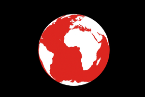
Illustration is the medium where I let my creativity fly. It seems to be the most natural way to capture and present my ideas. It lets me enrich my projects, adds depth and more meaning to designs which would otherwise seem ordinary.
My style is inspired by graffiti and street art as well as movie posters, but it's all still evolving. I love to produce t-shirt graphics in particular. More designs will follow soon so if you like what you see, check regularly on twitter @bartekodias (I don't spam people so no worries).


Animation
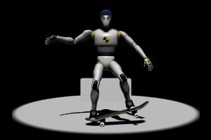
Animation is something I do when I have more time on my hands. I love storytelling and the whole process of producing a film. From an initial script and storyboarding to final editing and post production.
I have only two examples of my filmmaking work here but more are coming soon.